The Palette of Quiet Souls: Colors That Inspire Calm and Reflection
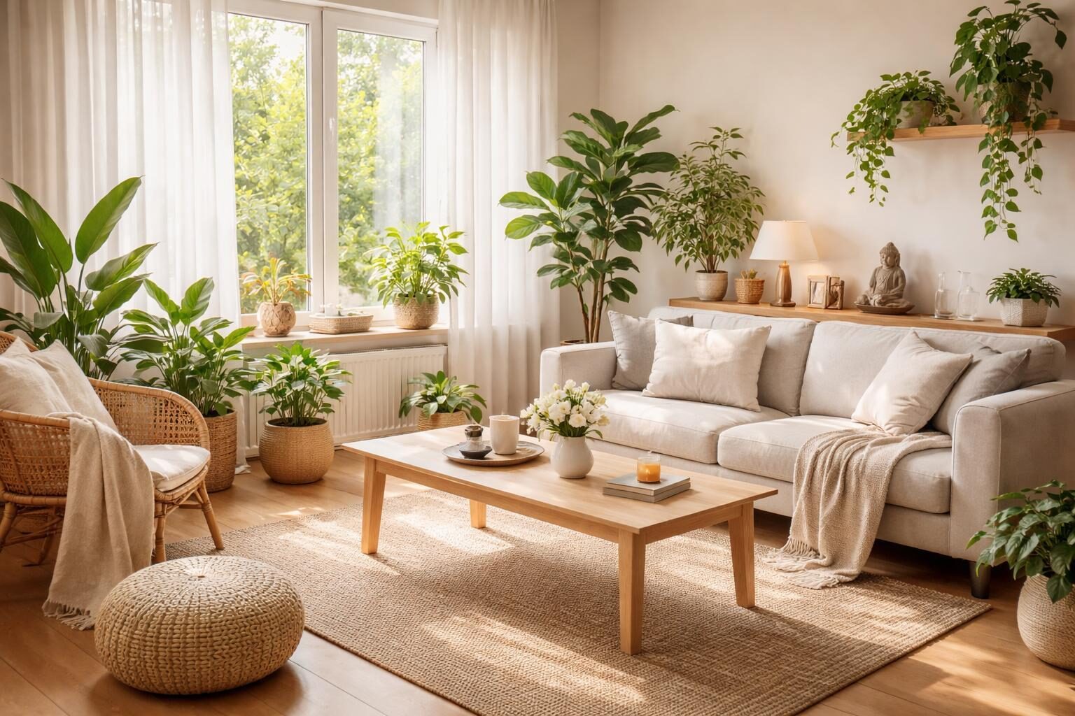
Colors are more than just simple decorations. In fact, they perform other meaningful and valuable functions. Aside from serving as your emotional anchors from time to time, colors are also subtle storytellers and companions for your inner world.
While some colors immediately ask for attention, others invite you to slow down. These soothing shades don’t compete for the spotlight nor overwhelm the senses. Instead, they create peaceful, quietly welcoming, and comforting spaces.
These softer, more grounding colors are perfect for quiet, introverted souls who appreciate calm environments. The reason is that they encourage reflection rather than stimulation.
***A Quiet Note: Some recommendations in this article are affiliate links. If you choose to purchase through them, I may earn a small commission at no additional cost to you. Your support helps me continue creating thoughtful, free content for The Introverted Pen. Thank you for being here. <3 ***
Colors and The Quiet Souls
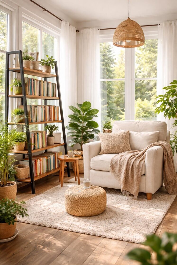
Everyone has unique preferences when it comes to colors, but for many quiet souls who are naturally fond of soothing environments, the shades that suit them are often softer and more grounding.
They look at these colors as their language of comfort, sometimes even saying the words they have a hard time expressing. Introverts who are fond of calm, reflective environments often choose hues that represent balance, serenity, and strength.
In this article, you will learn a few colors that resonate with introverts or anyone who prefers the quiet and calm. It also tackles simple ways to integrate these colors into daily life, nurturing authenticity and peace.
This isn’t strictly following design rules or claiming that introverts or quiet souls should only wear specific colors, though. It’s about the opportunity to explore shades that most quiet souls find soothing and comforting. You’ll also learn simple ways to integrate colors more intentionally into your everyday life.
So whether you’re choosing clothes, decorating your home, picking everyday accessories, or building a cozy reading corner, colors can subtly influence how you feel about them.
Sometimes, even the smallest change, like having a warm blanket, ceramic mug, or muted notebook, is enough to turn plain, ordinary moments into something soothing and restful.
Colors and Their Effect on the Atmosphere
Colors wield their own influence and power. They can even set the mood of a space.
For instance, soft hues usually create a sense of calm and openness, forming an environment that supports your focus, creativity, and relaxation. It could be a peaceful space that invites you to slow down and be in tune with yourself and your own thoughts.
Bright colors also tend to lighten your mood, while gloomy shades may bring you down. That’s how impactful colors are.
The Colors of Quiet Souls
So what colors fit your quiet, introverted personality and your love for peace and solitude? Here are some soothing options and inspirations for creating quiet spaces featuring each color.
1. Sage Green
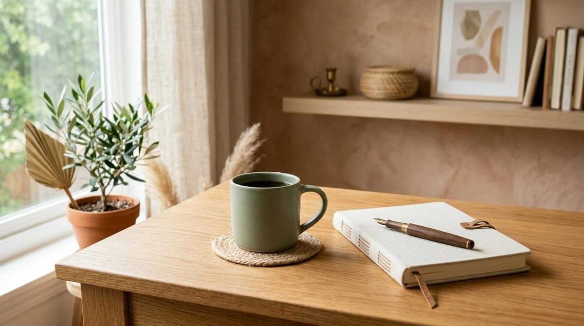
Sage green is the color of quiet growth because of its balanced and calming nature. It represents growth without the intensity of other hues and shades, thereby supporting your need for stability and tranquility.
Featuring a slightly gray undertone, sage green is not visually intense, making it the perfect hue for a backdrop. In addition, it has a strong connection to nature and the sage plant, known for its medicinal properties. This is why sage green also represents renewal and growth.
Sage green also exhibits a muted presence, which means it doesn’t distract but rather promotes calm and focus. This makes it ideal for environments that stimulate creativity and new beginnings.
Quiet Space #1: The Reading Nook
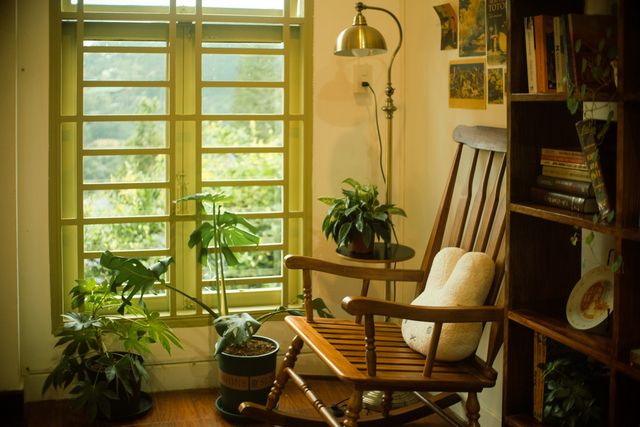 You
don’t need one big room to have your own reading nook. You can pick an unused
corner in your home and turn it into a soothing space for reading and
recharging.
Featuring sage green, you can add the following items to this corner that could turn into your quiet reading sanctuary:
- A comfortable chair positioned beside a window
- Sage green throw blanket
- Warm mug
- A couple of leafy houseplants
Adding some indoor plants in the space lets you bring nature indoors, making it even calmer and more inviting. You can even make caring for these plants a part of your quiet daily ritual. In that case, you can use a sage green watering can that blends beautifully with the space.
2. Warm Beige and Soft Cream
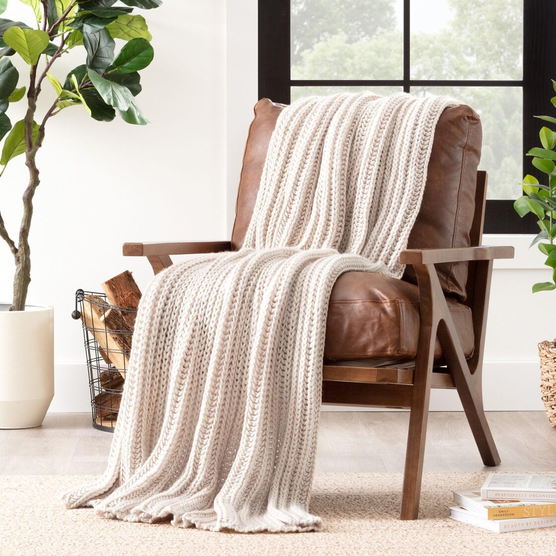
If you’re after a shade that’s warm, timeless, and simple, go for warm beige and soft cream. You’ll immediately notice their calming effects, stimulating everyday comfort.
These colors are good choices in fashion and design because of their strong connection to warmth, tranquility, and softness. Both warm beige and soft cream can create a welcoming atmosphere that stimulates comfort and relaxation, making them perfect in spaces intended for unwinding.
The shades also have warmth and softness that make you feel safe and at ease. It can help foster a peaceful environment and reduce stress.
Quiet Space #2 – The Slow Morning Kitchen
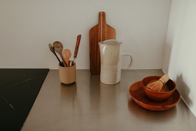
Make your mornings slow and comforting by filling your kitchen with warm beige and soft cream accents. Invest in kitchen decor and items that are not only functional but also pleasing to the eyes, including:
- Coasters
- Placemats
- Kitchen towels
- Curtains
- Rug/mat
Have a handmade ceramic mug ready so you can enjoy drinking your coffee or tea each morning. Also, keep your mind clutter-free and start your day right with a ceramic kitchen utensil holder. It keeps your kitchen utensils neat and organized, preventing mess that may also affect your thinking and mood.
3. Dusty Blue
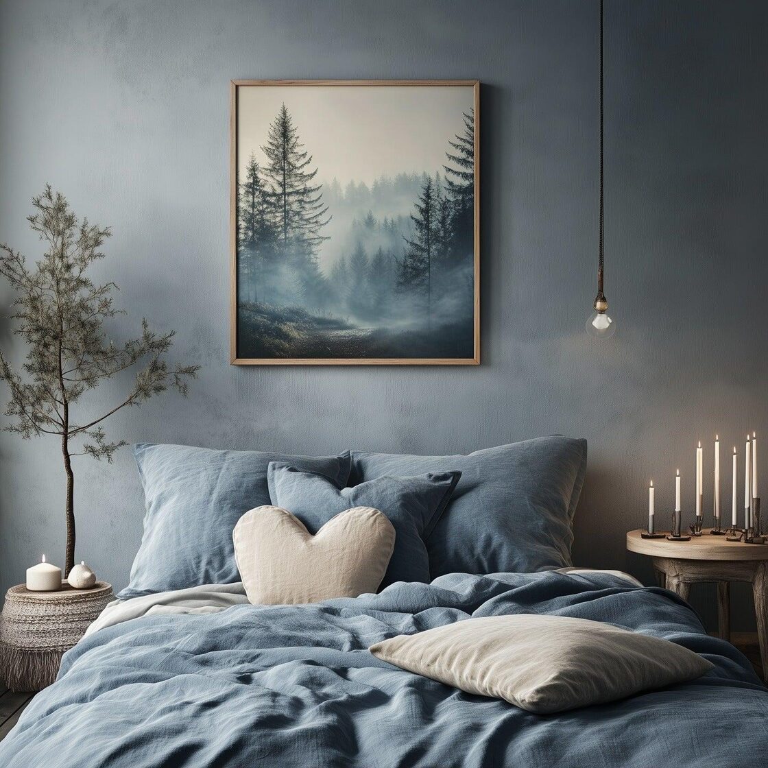 Dusty
blue is another calming color that often signifies gentle clarity. You can use
this shade to nurture a harmonious and serene environment because of the sense
of relaxation and peace it evokes.
Seeing this shade around you or wearing it personally can somehow balance your emotions and sense of clarity, as it’s relaxing and pleasing to the eye. With that, you get to hone your quiet confidence, ability to reflect, and mental focus.
Furthermore, the understated, subtle tone of dusty blue conveys elegance and sophistication. This makes it a timeless and versatile shade, especially when used in design.
Quiet Space #3: The Restful Bedroom
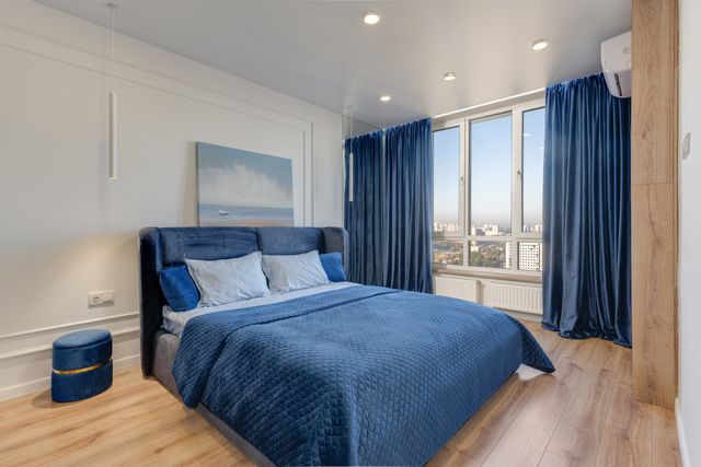
Display an elegant large-framed artwork in your bedroom to help you relax after a stressful day. It can be a soothing picture of the sea, the mountain, the clouds, or any other artwork in blue.
Also, make your bedroom the perfect spot for slowing down and resting by featuring the following items in the calming dusty blue shade:
- Linen duvet covers to reinforce the calming atmosphere in the room
- Soft lighting
- Pillowcases and blanket
- Blue planner or notebook to bring clarity to your thoughts
Use the room’s soothing atmosphere, reinforced by the dusty blue shade, to clear your mind before sleeping. You can even grab your notebook to write down all your thoughts first, so you won’t have to overthink once you finally hit the sack.
4. Earthy Brown
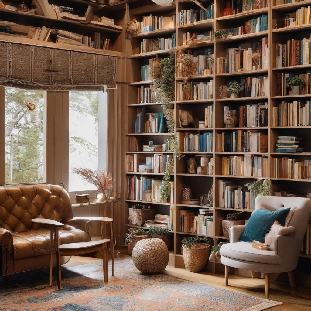
If you like the feeling of being grounded, the earthy brown color suits you. It is so grounding as it possesses the warm tones and shades of wood, stones, and soil. With that, expect it to provide a sense of familiarity and security.
Many choose to integrate this color in spaces intended for focus and relaxation. The reason is that it often makes someone feel safe, comfortable, and stable. You can also easily connect the earthy brown’s calm to nature.
Apart from making you feel grounded, earthy brown also demonstrates security and resilience. Furthermore, you can strongly associate the color with comfort, warmth, and anything organic, thereby reflecting the Earth’s support and foundation.
Quiet Space #4 – The Grounding Workspace
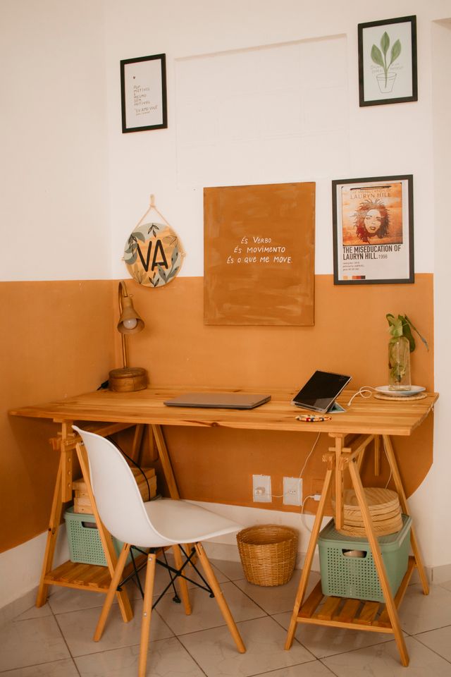 Make
your workspace look grounding and relaxing by decorating it with things
featuring the earthy brown shade. When you feel grounded and relaxed, you’ll
feel more inspired and motivated to work, which can help with your
productivity.
Consider adding these earth-inspired items in your workspace:
- Wooden furniture
- Woven basket as home décor, storage, or planter
- Wooden desk organizer to keep your space both tidy and visually calming
Keep a leather journal with you, too, and make it easily accessible. That way, you can use it for daily journaling. Use it to write down your thoughts, ideas, daily experiences, or anything you’re thankful for. It’s a grounding activity that will also free your mind from clutter.
5. Muted Lavender
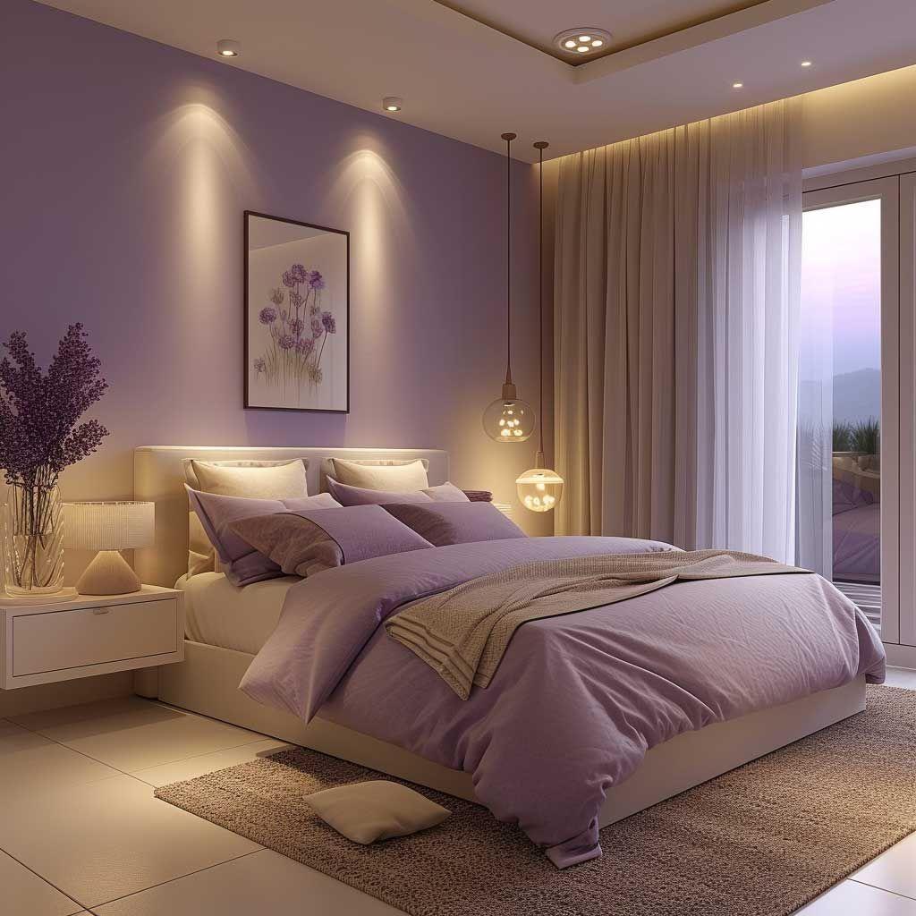
The muted lavender hue has calming and restorative properties, so it’s a good representation of gentle rest. It’s a great color for a space where you intend to relax and rejuvenate. The reason is that it has a soft and muted tone that’s linked to lower anxiety and stress.
It’s a gentle color that helps relieve stress, lift your mood, and eliminate pressure, making it beneficial for your mental health. That said, it’s the perfect color for bedrooms, meditation spaces, and other spots intended for unwinding or enjoying a peaceful evening ritual.
Quiet Space #5: The Evening Retreat
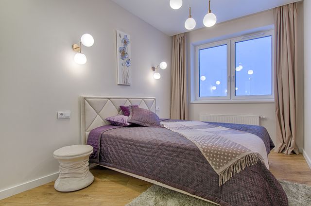 A
relaxing evening retreat, especially after a hard day at work, is a dream for
many. The good news is it’s not that hard to recreate this scene at home.
Here’s how you can set a space for your evening ritual with muted lavender as
the primary shade:
- Using bedding with a matching lavender pillowcase and blanket
- Wearing a cute and comfortable pair of lavender pajamas
- Using lavender lighting to encourage relaxation and creativity
- Keeping a lavender journal for reflective thoughts or creative writing
Don’t forget to pair up all these items with a lavender essential oil diffuser. It’s a nice tool to have at home as it gently signals it’s time for you to relax and unwind.
6. Soft Gray
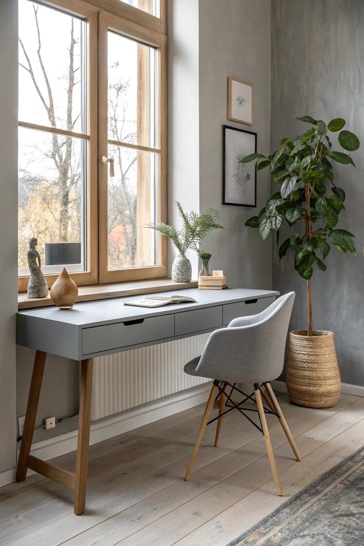
Another color for quiet personalities is soft gray. It is calming and soothing, thanks to the color’s ability to provide an understated, neutral backdrop that absorbs and diffuses energy.
One reason to love soft gray is that it doesn’t incite strong, intense feelings, making it versatile. It tends to complement different settings and adapt in varied applications.
For instance, the color works for someone who wants a peaceful bedroom environment while also effortlessly blending into professional and hectic office settings. Due to its calming effects, you can thoughtfully use soft gray in spaces where minimalism, focus, simplicity, and tranquility are top priorities.
Quiet Corner #6: The Creative Corner
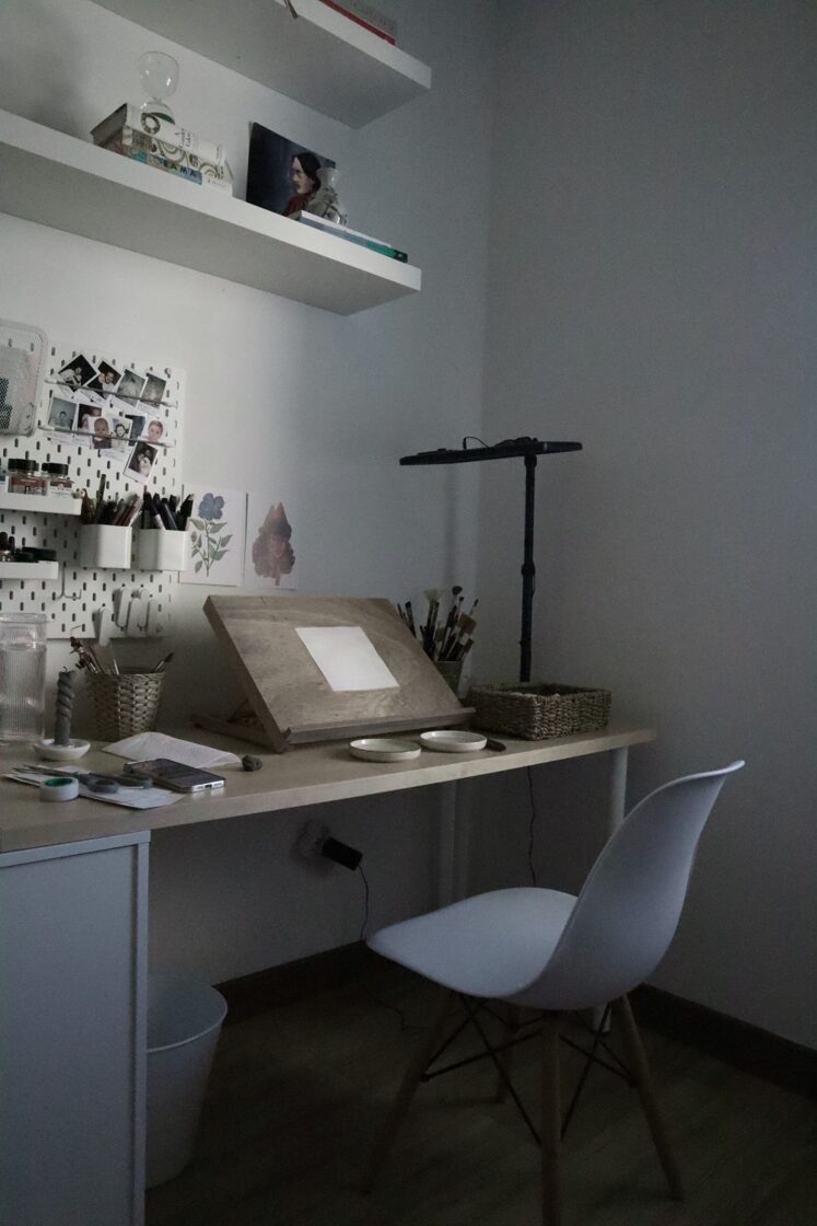 Harness
your creativity by having your own creative corner at home. You don’t need a
large space for this. Just find a well-lit and quiet area at home. It could be
an unused corner, a cozy nook near the window, or just a part of a large space.
The goal is to have a small area where you can enjoy your creative hobbies. Keep your materials within easy reach so you can start creating whenever inspiration strikes. Some items in soft gray that should form part of your creative corner are:
- Cups and jars to store pens, markers, and brushes
- Drawer organizers to store and keep tiny items, such as clips, erasers, and sharpeners
- Pegboards or shelves
- Creative guides and art books
Have your own high-quality, soft gray hardcover journal in your creative corner, too, as it supports slower, more intentional writing that can harness your creativity.
Building Your Own Quiet Color Palette
Deciding to stick to a quiet palette does not necessarily mean limiting yourself to a single color. As a matter of fact, you should think of the whole process as creating a collection of balanced and comforting shades that genuinely represent your personality.
In other words, you’re allowed to mix and match. For instance, you can pair soft neutrals with gentle accents. It’s also a great idea to blend earthy tones with vibrant shades that somewhat evoke simple joys.
A muted green may feel peaceful, warm beige may create a feeling of comfort, and a touch of dusty blue can make the space feel calm.
Other nice color combinations to try would be:
- Sage green + cream
- Beige + brown
- Blue + gray
- Olive + linen
Also, take note that you don’t have to force yourself to follow trends when it comes to mixing and matching colors. Avoid just copying someone else’s idea of what feels peaceful for them.
Remember that the most meaningful colors are those that make you feel at home, truly resonate with you, and make you feel comfortable. So, give yourself the chance to experiment.
Mix various shades and slowly explore combinations that reflect your own quiet corner. A quiet palette doesn’t limit your options but gives you intentional choices instead.
Practical Ways to Use Color as an Introvert
Colors are part of everyone’s life, not just introverts. Aside from being symbolic and meaningful, colors also serve as practical tools for introverts as they navigate their daily lives.
Here’s how you can further maximize the positive effects of color, especially for someone like you who values peace and quiet:
- Update your wardrobe and add muted tones – By wearing clothes with muted tones, you can show your quiet confidence without demanding attention.
- Design your workspace with soft greens and blues – This can create a soothing environment that enhances focus.
- Use a quiet, thoughtful palette for digital presence – For instance, you can use your chosen soothing colors in your LinkedIn or social media posts, blogs, or presentations. With that, you can convey your authenticity without the noise.
- Use soft fabrics, textures, and natural materials at home – As much as possible, prioritize the bedroom, as it’s your space for comfort and relaxation.
- Install the right lighting – Go for warm tones that represent relaxation. You can also choose cool tones if you wish to retain your focus.
- Pair your chosen colors with nature sounds or ambient music – This should create a holistic space where you can recharge your energy.
Final Thoughts

While the colors in your surroundings don’t have the power to change who you naturally are, they can still gently shape your daily atmosphere.
For quiet souls and introverted personalities, the decision to create peaceful spaces does not necessarily mean chasing perfection or looking for and following trends. Instead, it revolves around creating a comforting, restorative, and authentic environment.
Whether it’s your sage green journal waiting beside your favorite chair, a warm cup of coffee to start your day, or a soft cream blanket draped across your couch, these tiny details serve as gentle reminders to slow down.
And it’s the true beauty of a quiet color palette. Rather than asking for attention, it simply creates room for peace and solitude.